How To Come Out With Corporate Colours?
First, ask yourself what your company's image is. In other words, your company's branding. Check out my post on branding. This might help you to determine that. We can begin matching colors to your company image once we know what it is. The company image can be fun, relaxed, robust, firm, healthy, natural, and so on.
Colour CharacteristicsGreen: Nature, Healthy, Environmental Friendly Yellow: Joy, Sunshine Red: Energy, Passion, Love, Strength Blue: Harmony, Unity, Trust, Ocean, Sky By looking at the above colour characteristics, I guess you can tell how they are derived. Our brains relate colours to what we see in our everyday life and retain this information These information will be auto-retrieved when we need them. A kind of fast retrieval of our memory for instant use. I do not like to go deep into this "brainy stuff" about why our brains behave in certain ways. That will be a whole new topic belonging to Neuroscience. And such a topic seems too heavy to digest. Ok, at least for me to explain in words. In short, we relate colours to what we see in our daily life. For example, when we see blue colours, our brain immediately associates them with sky and water. Social Conscious On ColoursColour characteristics are created by all of us: our culture, our beliefs and our daily life. So, in one culture, a color may be considered unlucky, while in another, it may be perfectly acceptable. I find the most bizarre association is to link colours with gender. Why blue is for man and pink is for women? I can't find any evidence to support this association. But I guess we'll have to submit to the social norm once more. I hate social pressure to influence what i like. And I paid a price for being unique. Ok, perhaps being "rebellious". Though this "rebellious" thingy is still in me, I have learned to follow the general public, especially in term of arts. My philosophy: Arts serve larger audiences with more "likes", serve a larger purpose. But to consider every culture's beliefs during colour selection will be too much work to do and might end up fulfilling nothing. Select your desired colours and stick to the characteristics which you have given to them.
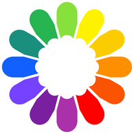
Colour WheelWe can use the color wheel to aid us in our decision-making. For your reference, I have a simple colour wheel for your reference. There are, of course, more colours available. With more colours, the larger the wheel will be.
Selection Tactics With Colour WheelsThe neighbouring colours on the wheels work well with each other. Colors that are farthest apart (opposite in the color wheel) have a high level of contrast, making each color stand out. There is no standard number of colours required for a logo. In general, 1 - 3 colours are usually applied to a logo. Match a few sets of colours and then choose your top choice from these sets. Below Are Some Selection Tactics:Pantone Colour ChartIf you are more particular in colour selection, I recommend using the Pantone chart to further assist you to making your colour choice. 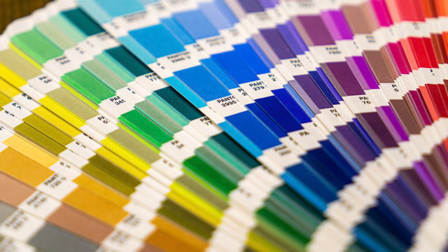 Pantone Colour Chart USING COLOURS GRADIENTColour gradients are the blending of 2 or more colours gradually. These effects are not commonly found in signboards as it is hard to achieve by spray painting. There are spray paint artists who can do the job well. But it is not that easy to find these artists. Sign makers will rather persuade you to use flat colors. However, since large format printing industry matured in the 1990s, we can now print gradients. Since then, colour gradients have become the new trend in sign making. Compare the letter 'S' below, which will you prefer? 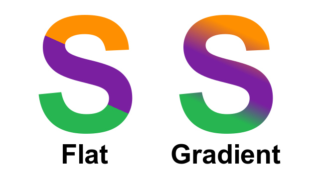 Click here to see example of colour gradients being applied in signage. Editor's Note:
0 Comments
Your comment will be posted after it is approved.
Leave a Reply. |
After getting a signboard right on top of the main door, one can start his/her business. Was it really that simple? There are more to that. We need to consider logo design, location, types of signage, etc,.
I will be sharing some tips on signage planning and decision making. Learn how to build an effective marketing campaign through the placement signage at the right location, along with other tips such as design and colours. Read on each post to find out more. |